Branding /
GRÖN
Branding
TASK
Branding
Client
CHALLENGE
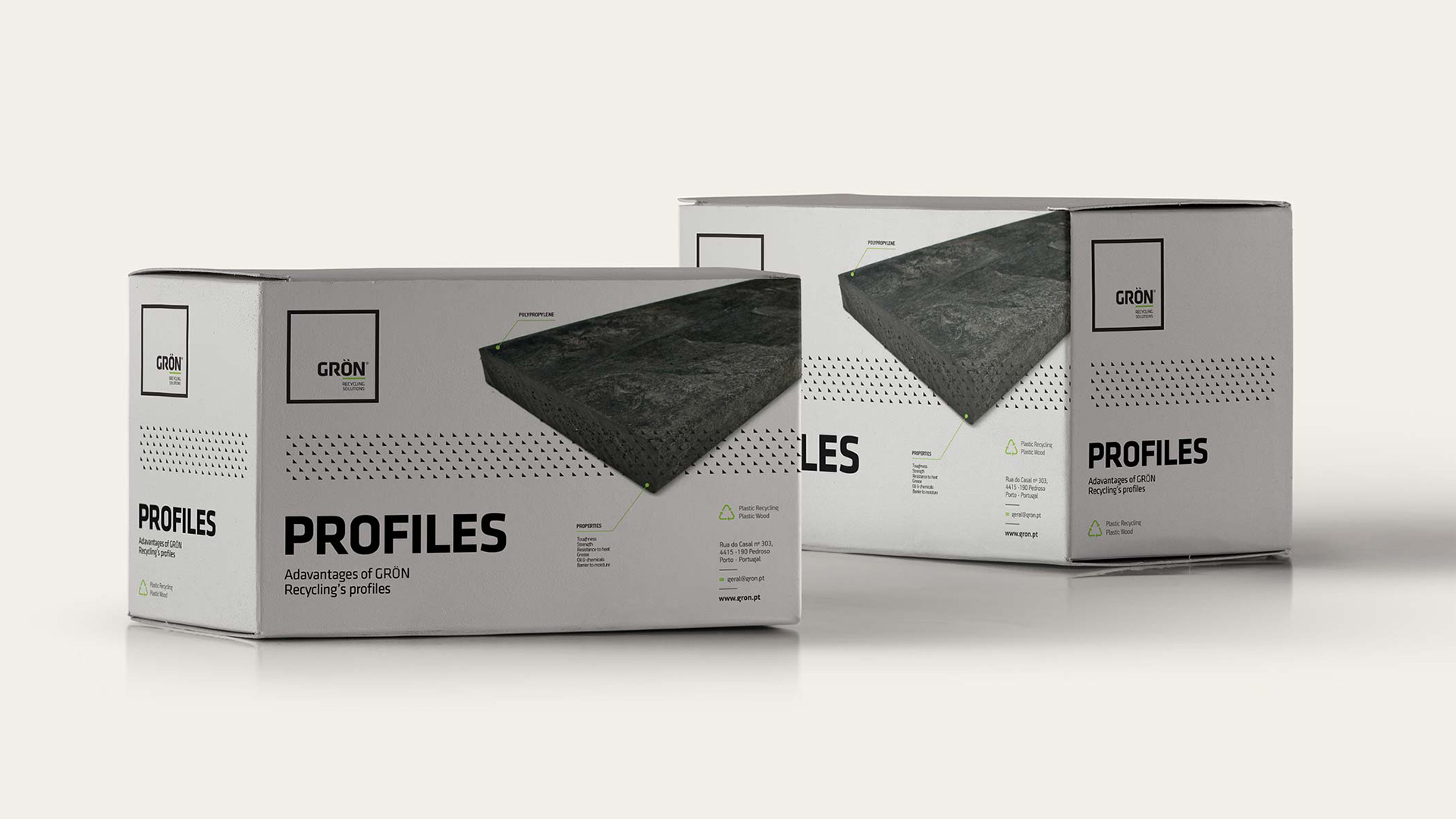
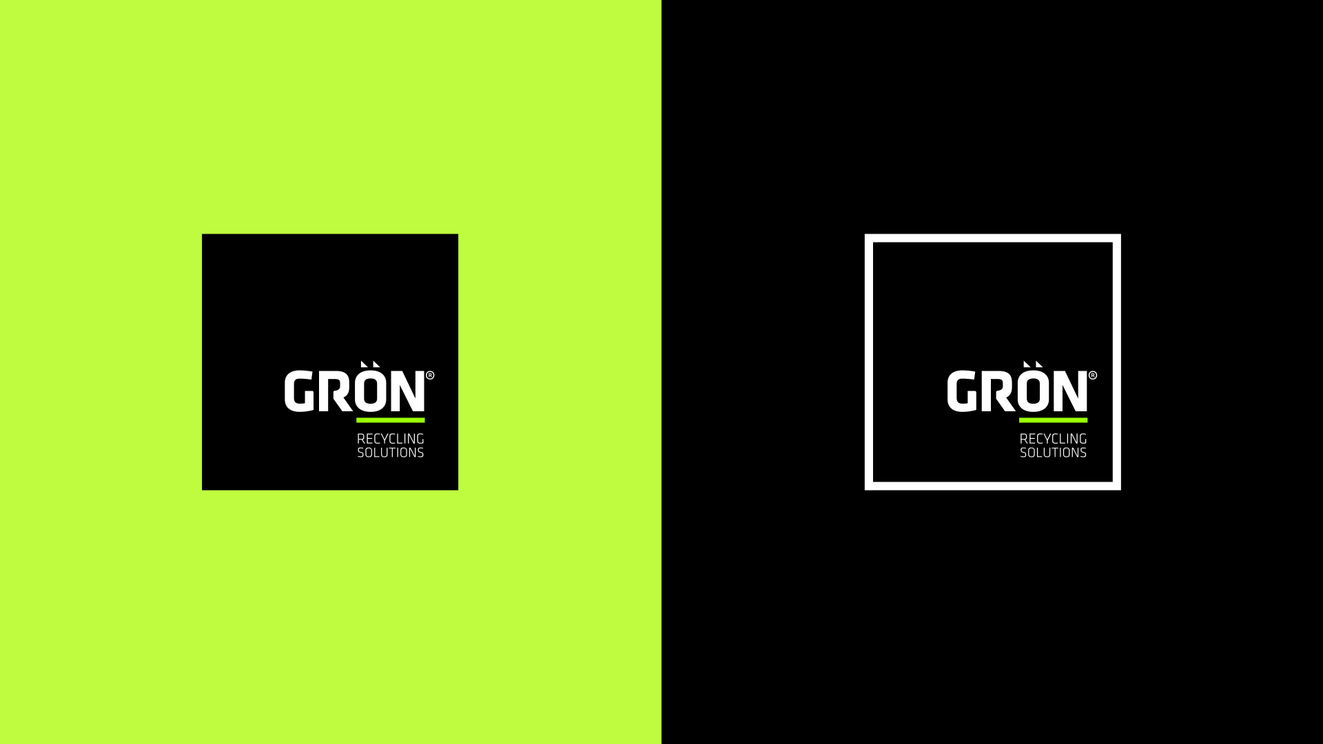
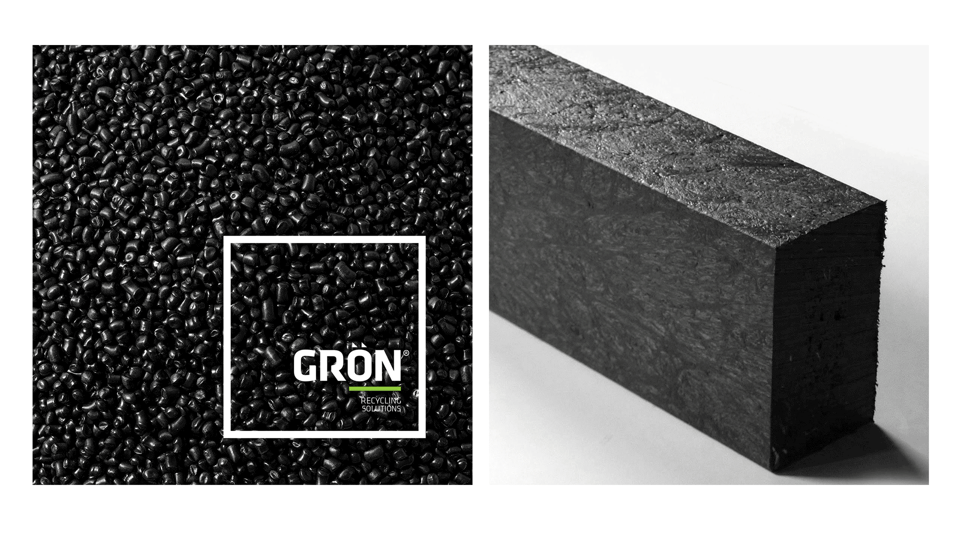
Having the word GRÖN (green in Swedish) as a starting point gave us the needed values the brand wanted to be imprinted on its visual identity.
The challenge was creating something beyond the obvious "eco-friendly" icon using the color green in conjunction with a singular font specially developed for this logo.
SOLUTION
The focus
was mainly on the process that the company intends to implement.
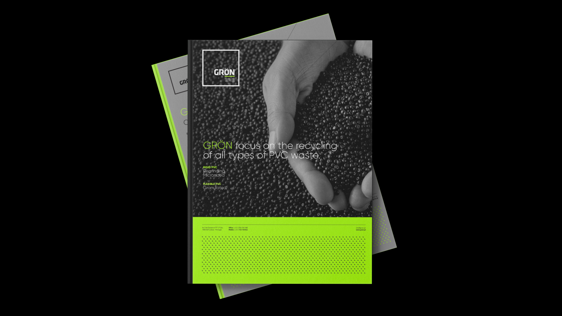
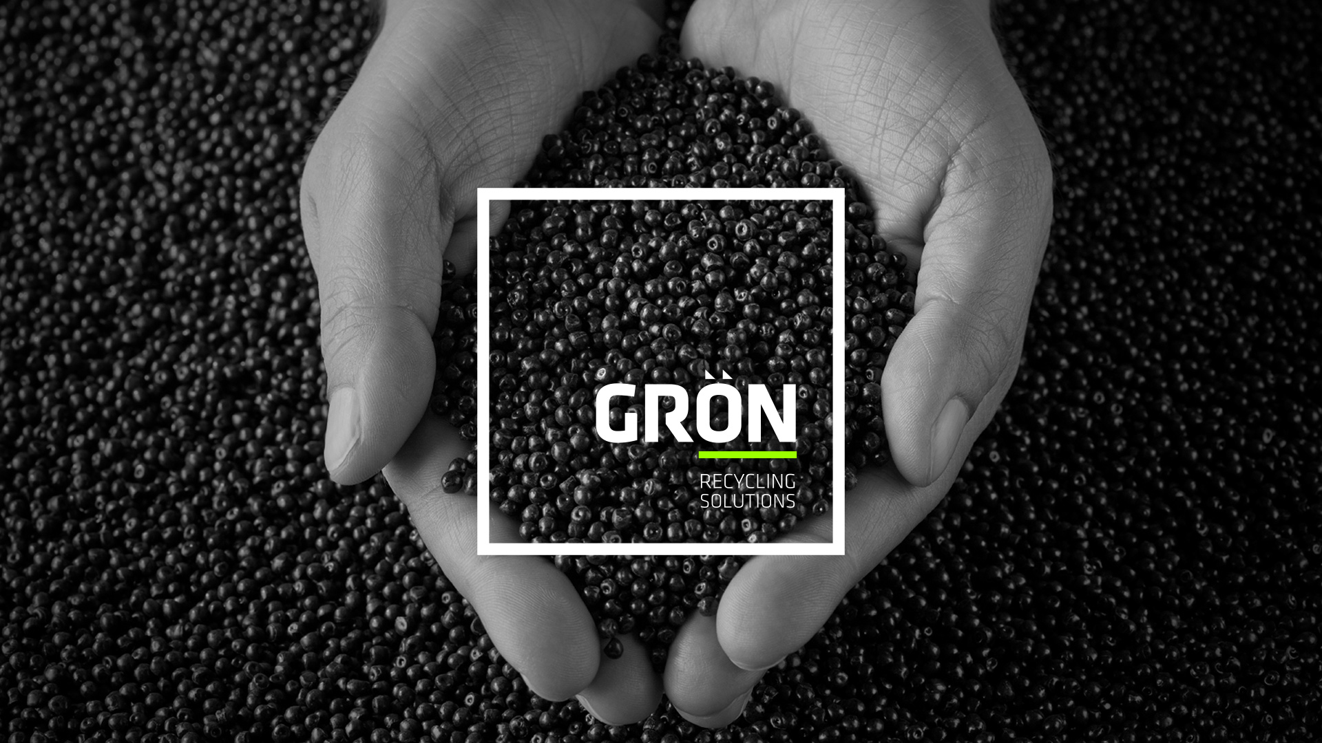
The reuse of materials for the recreation of raw materials gives rise to a notion of perpetuity, renewal, and infinite process.
The brand symbol created is a representation of that same process in a modern and stylized fashion.
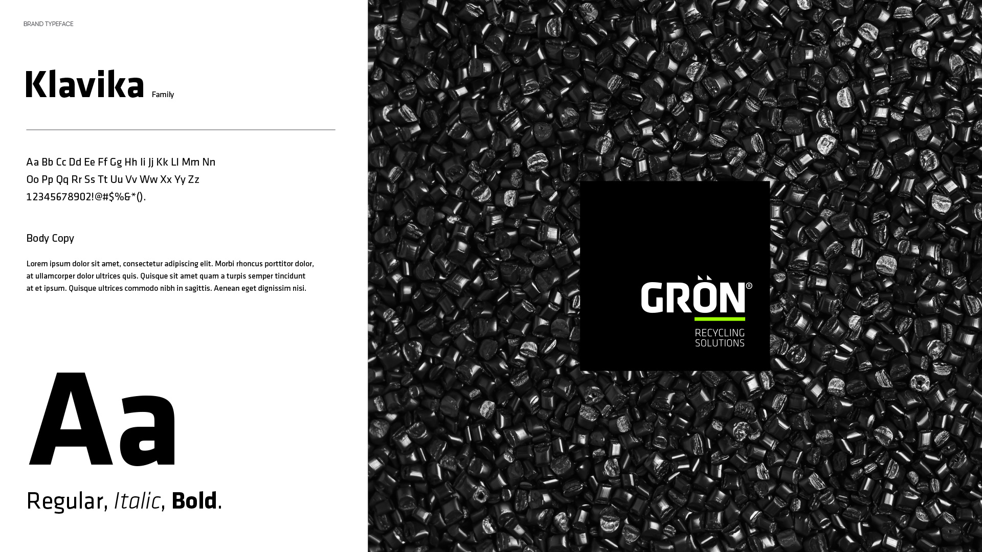
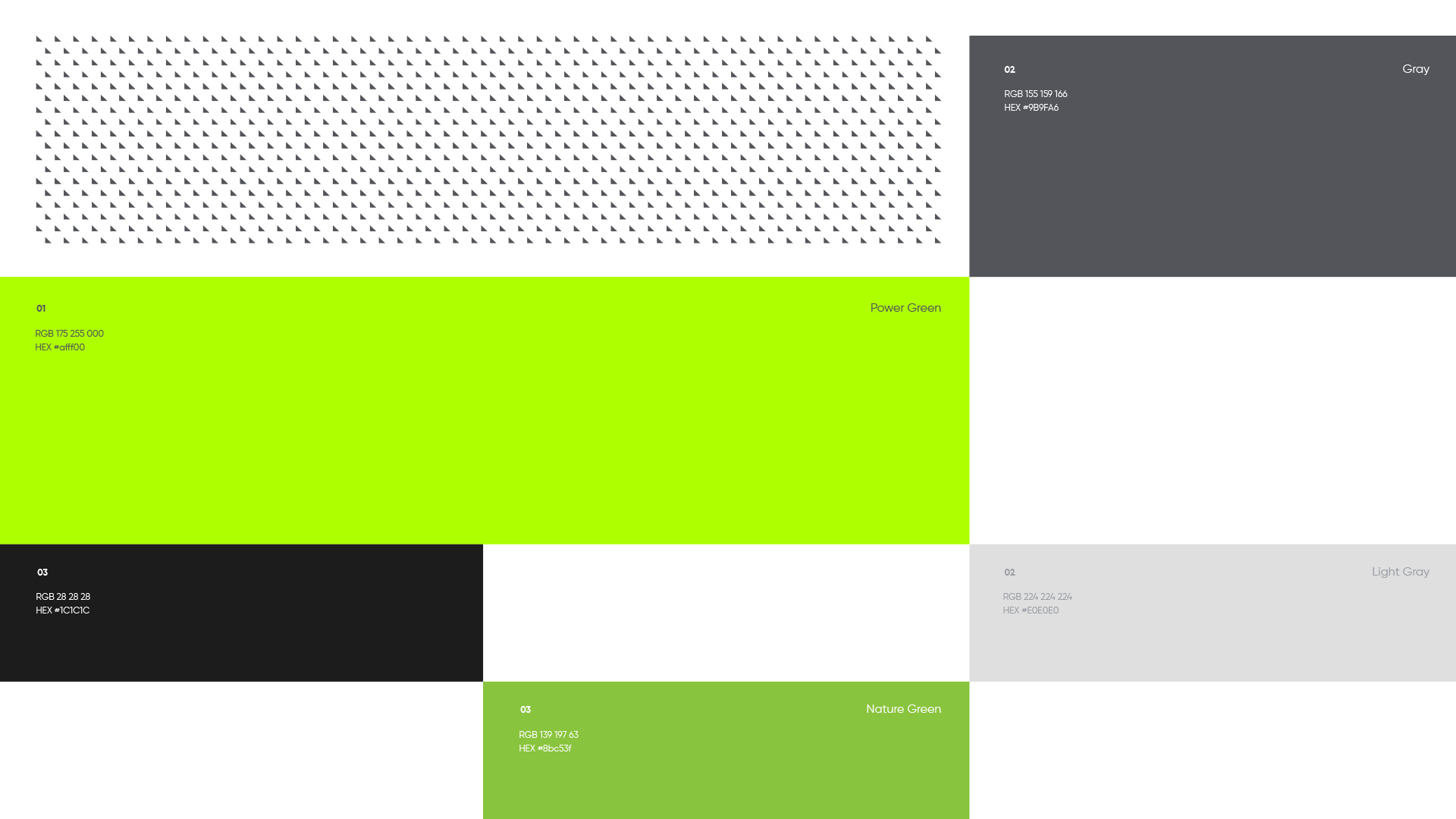
With a clean, objective, and modern image, it positions the brand in line with its green values and with the vision of a brand that wants to lead, be universal, and have a technological feel that can reflect its processes.