
Branding /
COTEC - Prémio Produto Inovação
Branding & Identity
TASK
Branding
Client
CHALLENGE
Developing the identity for COTEC's prize was a work of restrained creativity. We needed to stay within reach of a "parent brand" but were given all the latitude to innovate.

SOLUTION
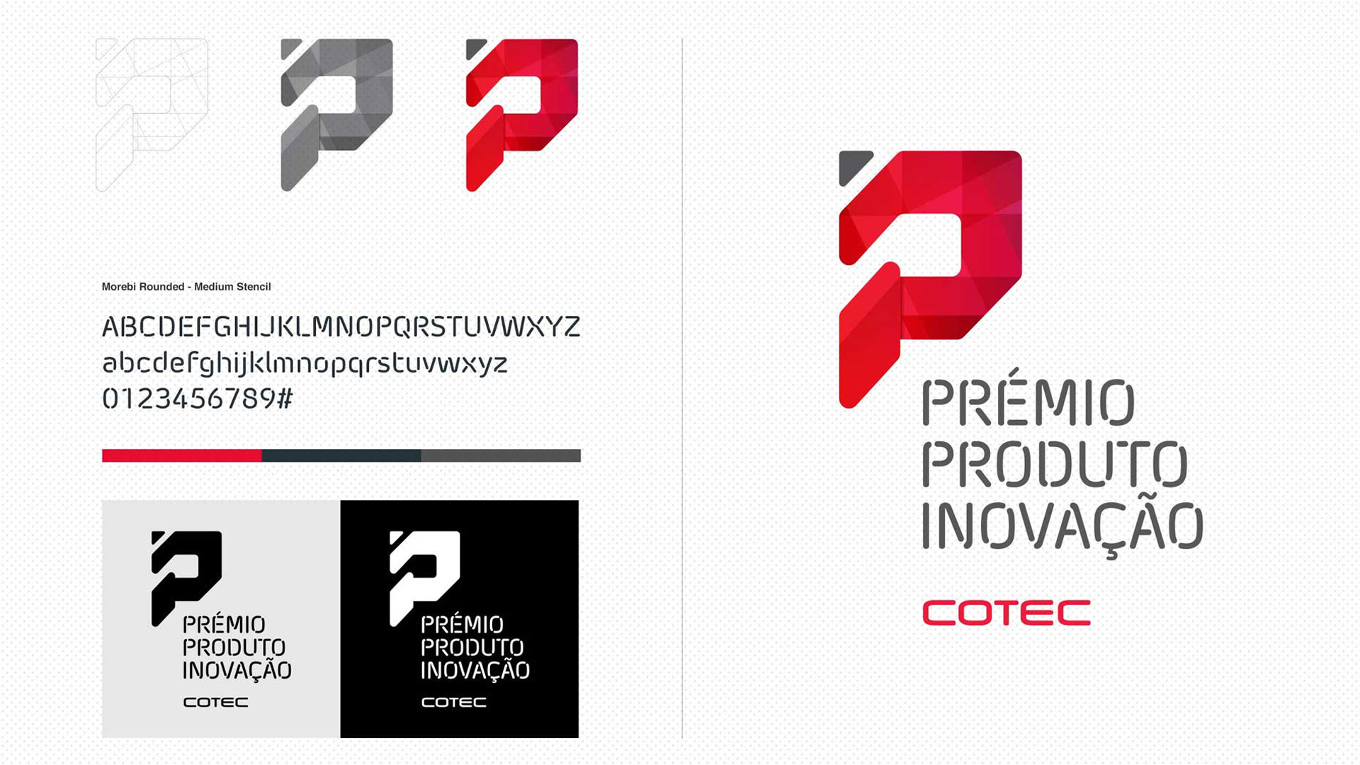
The deconstruction of the letters I and P gives way to the silhouette that resulted in the prize's icon.
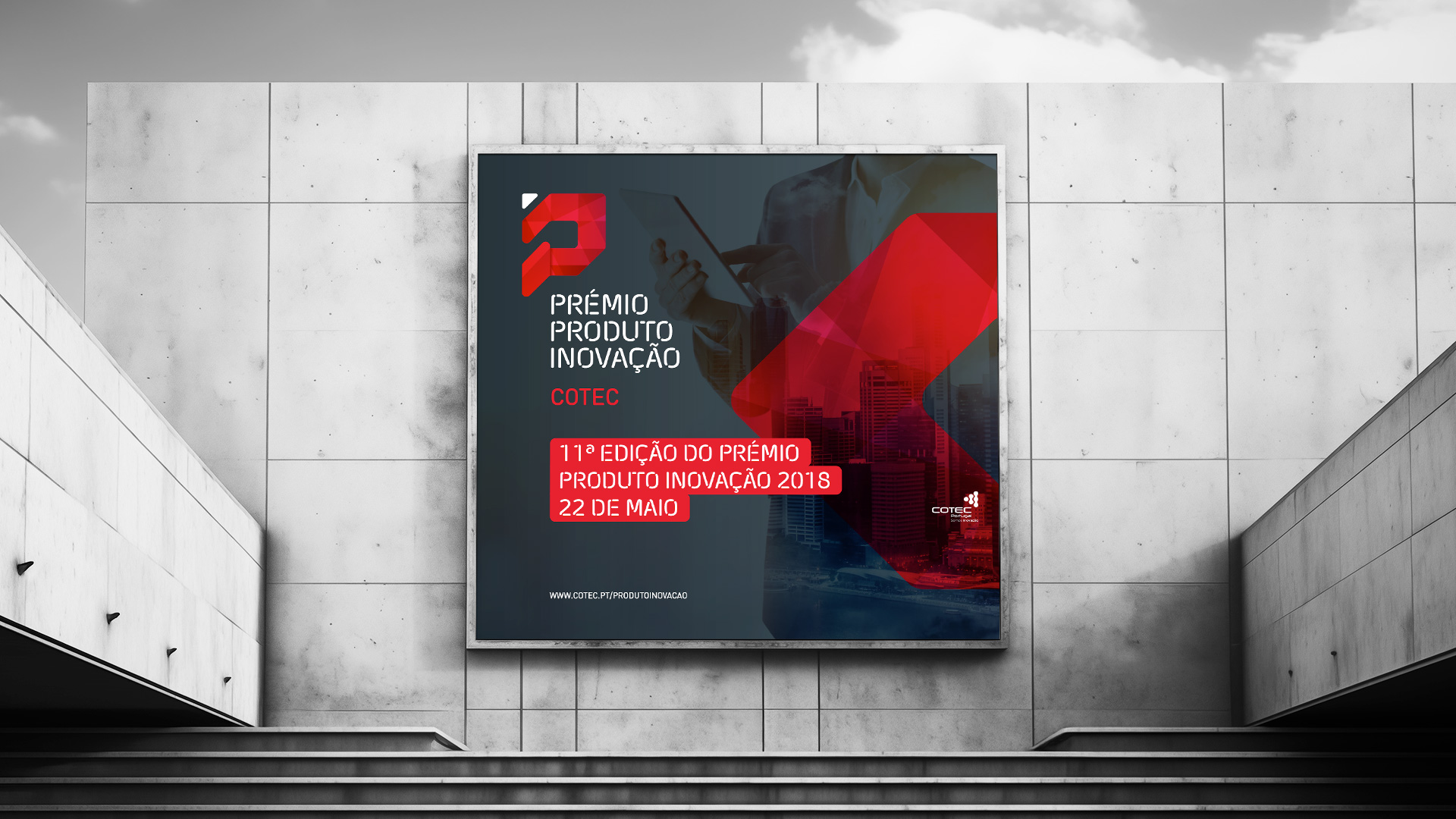
Not straying much from COTEC's colors and tech feel, the brand identity stands on its own two feet being capable of nourishing a plethora of branded materials.

